Owls, Devils, Wagons: Adventures in Picture Lotto
C. Clement, Picture Lotto Game Card, Samuel Gabriel Sons and Company, circa 1950
This is a re-edited post with updated examples and discussion. In some respects I am speaking directly to students, as this blog has transitioned to being, above all, a teaching tool. But the more public dimension of this writing remains interesting to me, as the literature of writing about drawing (aside from the lingering Beaux-Arts tradition) remains more limited than might be ideal. How do we talk about image-making of symbolic or calligraphic varieties, or which rely on such ways of seeing? —July 2019.
Last fall I taught a methods course to illustrators and cartoonists (once called Visual Worlds, about which I have written before here and here), now entitled–more concretely–Image and Story. The first portion of the class is, for lack of a better term, diagnostic.
Early in the semester I handed out a set of four sheets, each of which included six boxes...
Draw Me form, Image and Story assignment (a version of which has been used from 2010-2016).
...making a total of 24 drawings to be required. When 13 students did the project, it produced 312 drawings, which is a decent data set for reflection. We looked at them yesterday. A significant variety, as one might expect: but also, shifting conventions and forms of visual logic within the same student's group of works. That was by design: I encouraged them to try different approaches.
A valuable question: is the group or subgroup a meaningful set? Do the images cohere, visually and/or conceptually? The project was not couched in those terms: rather it was presented in a very matter-of-fact way: please fill in the boxes. The subjects range from objects to animals to people. There are a few wild cards thrown in, like "chemistry," which require rhetorical reasoning.
Typically the range of responses extends from the purely symbolic to the rendered or modeled, with many steps in between.
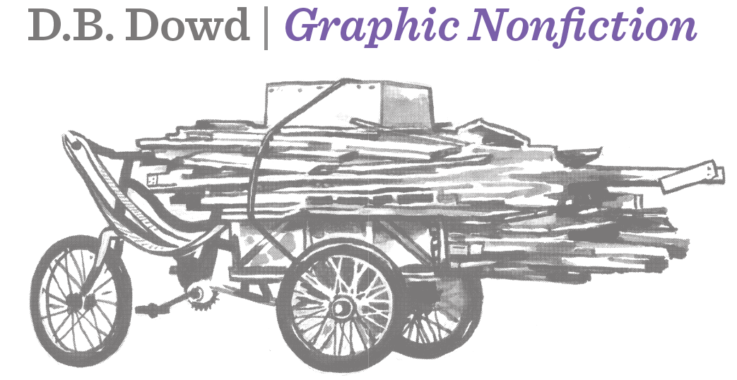
C. Clement, Wagon, circa 1950
One of the specified subjects was wagon. The Picture Lotto wagon (of which more presently) shown here might qualify as a Platonic wagon.
Another subject was devil. Lots of class discussion was devoted to the latter. As that discussion unfolded, I slowly remembered that I had made just such an emblematic devil some years back. Here he is in context, with citation.
D.B. Dowd, screenshot detail, Animated Ulcer City Landing Page, 2004. This project was animated by Melanie Reinert who worked in my shop back in the days of Macromedia Flash. That's a self-portrait on the phone, along with a rat (a favored trope of Melanie's) and a winking devil with flaming charcoal briquet. The devil illustration had been created a few years earlier for a tee shirt design to commemorate a family vacation at Seven Devils, North Carolina. He's been squashed a little to fit in the elliptical sign shape. The same character also appears very briefly in Scenes from Starkdale, Ohio, an experimental animated project from 2006-07.
A third subject was owl. Owls have long been conventionalized in cartooning and illustration. They have also been beaten to death by the home decor industry over the past several years. Enough with the owls! some students complained. But they provide a useful problem: how to simplify and/or codify a form that already has a set of "rules" for depicting it?
Ward Kimball, character design for Professor Owl in Toot, Whistle, Plunk and Boom, an Oscar-winning educational short from 1953.
In 2016 I made an owl illustration, too. Said owl is connected to my undergraduate experience at Kenyon College in Ohio.
I created him to commemorate an a cappella group I sang in many years ago.
For a discussion of the limitations of logo/mascot drawing in the Age of Adobe Illustrator: Of Billikens and Plaid-Patterned Elephants.
D.B. Dowd, Kokosinger Owl, 2-color version. 2016. This design was used on a baseball cap for the 50th anniversary of the Kokosingers' founding in academic year 1965-66. The a cappella group got its name from the Kokosing River, which is alleged to mean "owl creek" in the American Indian language (Miami? Delaware?) of origin.
Emblem-images like these do straightforward work, but they can be clunky or graceful; diffident or fresh. For a cultural (as well as professional) source of contemplation, consider a midcentury visual game, Picture Lotto.
Picture Lotto Game, Samuel Gabriel Sons and Company.
The pink-field illustrations above are picture lotto cards, akin to bingo cards, used for collecting game pieces. The images in both cases are credited, incompletely, to one C. Clement, noted on the box cover (not shown). My friend and colleague Linda Solovic found them at a flea market this summer; she took the box and the game pieces, I got these. The game was produced by Samuel Gabriel and Sons Company, circa 1950.

Scott Gericke, cover design, Stick Figures: Drawing as a Human Practice (Spartan Holiday Books in association with the Norman Rockwell Museum, 2018.)
I reproduced some of the C. Clement illustrations in my book Stick Figures: Drawing as a Human Practice (2018). Which I loved doing, by the way—a celebration of great but effectively anonymous work, excavated from history.
Golden Funtime Punch-Out Books. Golden Press, 1962.
The Golden Funtime version makes explicit what the Samuel Gabriel game leaves implicit: categories of things.
The collection cards for the former organize the material into groups: Travel, Pets, People, Toys and Things We Use.
Illustrator Uncredited. Golden Funtime Punch-Outs: Toys and Things We Use. 1962.
I have added a few scans from a big stack of cards I picked up at a St. Louis antique dealer. These images are from an educational Uno deck published by Kenworthy Educational Service in Buffalo.
Illustrator Uncredited, Flash Cards from Uno: A Phonics Game, manufactured by Kenworthy Educational Service, Inc., of Buffalo, NY. No. 2192. Published 1957, following several editions with different illustration and typography from the mid 1940s. I found a library entry in Melbourne Austraila that credits guide book authorship to one Stella I. Wood. My set does not include a guide, though there is a pad of score sheets.
The illustrator(s) working on this project had widely variable days in quality. Some of these (like lady) are lovely; others are sturdily competent (like car). Street seems tossed off, even careless, and the logs for smoke are a bit indifferent. I'm rather fond of enjoy, however. Too bad the format serves the vertically-oriented images so poorly.
C. Clement, Television, circa 1950.
Back to the Picture Lotto sets from Golden Funtime and Samuel Gabriel. Here's evidence that people at these firms looked at each other's work. In both cases, the image for television features a console TV set with a puppet show playing.
Illustrator Uncredited. Golden Funtime Punch-Out. A television that looks sort of like a radio. The puppet is the point. 1962.
The puppets in both cases suggest European Punch and Judy marionettes. And Howdy Doody was a marionette. But the most influential television show involving puppets from the time period was the brilliant Kukla, Fran and Ollie, which debuted in the late 1940s. Presumably the Punch and Judy profiles had more generic value to these illustrators in 1950, though by 1960 the same approach seems likely to have been a teeny bit dated. (KFO went off the air in 1957, but Fran Allison and her pals enjoyed a long career in varying formats after that. I remember seeing KFO reruns as a child.)
Fran Allison with Kukla and Ollie. Circa 1950.
SEPTEMBER 2021
Seniors: you will move forward from your second round of work according to one of two approaches. In both cases, you will produce 12 finished pieces. I would like you to focus on having a working plan for your set on Monday September 13, and substantial progress with type studies (and color studies as necessary) for Wednesday the 15th. After Wednesday, we should be down to production and finish work. The final due date will announced at the end of class on 9/15.
1) You can adapt the rectangle. If you want to use a proportion more like a playing card, you are welcome to do so. They are to be considered as objects you hold in your hand. Think trading cards or game elements. Ultimately, their physical presence will be important.
2) You must integrate type or lettering. I suggest machine type for starters, so you are not distracted from the drawing problem of making the things/characters.
3) Keep the palette limited: you can go up from two to three colors, if you wish, plus white.
Folks who choose Option A will produce a contemporary version of Picture Lotto. Choose three of the given categories (Travel, Pets, People, Toys, Things We Use), with a sixth option also possible: Things We Fear.
Option B is for those interested in the people prompts: the milkmaid, the pirate, the circus performer, etc. Your group of 12 will consist of two sets: 6 occupations, and 6 People from Other Times and Places. Costumes will probably be important, and provide a chance to explore the line-and-shape dialogue we talked about in class.
NOTE: It goes without saying that representations of Other in prior eras can be–well–complicated. For a discussion of same in the work of the husband-and-wife team of the Hollings, have a read of the entry focused on Lucille Webster Hollings, one of the entries in our Women Illustrators project, explained here. Some Hollings' images below.
Have fun!
The Hollings (Holling C. Holling and Lucille Webster Holling), Netting Fish, in Children of Other Lands, Platt & Munk, 1929.
The Hollings (Holling C. Holling and Lucille Webster Holling), detail, title page, Children of Other Lands, Platt & Munk, 1929.